How to take the perfect flat lay
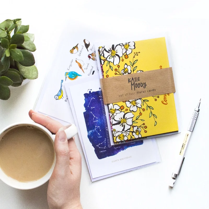
I do love a flat lay and so, it would seem, do most of Instagram. I take a lot of ‘top down’ photos because they’re the perfect way to showcase multiple things, add personality with the accessorising and are easy to arrange and style on flat surfaces (hence the name).
I have started styling a lot of my cards in my Etsy shop in this way, and I do think it helps set the scene and occasion - as well as being a good way to show size depending on the props you use.
Flat lays are a style I’m drawn to and are my first thought when photographing my artwork for Instagram or my portfolio. While I am by no means an expert, I wanted to share my own process, as well as tips and ideas for how to create your own perfect flat lays.
01. Backgrounds
Most of my flat lays have white backgrounds because I like the clean contrast and to have the focus only on the product. This is just personal preference though - you can use a background to add colour, texture and mood to your photo. The best thing about flat lays is that you can cheat a background because you only see what is in frame. Wallpaper samples are an absolutely fantastic and free way of experimenting. Pieces of slate and old bits of wood can also be used depending on the atmosphere you are after.
02. Props/Styling
This is one of my favourite parts of photography in general - and that’s ‘dressing’ the photo to make it look good. It is also a lot of placing things and taking it away, adding something new or turning an element so it’s at an angle to create the ‘perfect line’. Most of my process is this part as styling your flat lay is what makes it stand out.
First of all, choose your props. What is it that you’re trying to show as your main subject(s) in your flat lay? Do you have anything that compliments the theme or establish a story behind it? Use props that tie in to your subject and strengthens the theme and message you are trying to portray in your photo.
Here are a couple of examples:
A paper product (a card / a painting / an art print
This is definitely the focus of most of my photos as an artist. Whether I am taking product shots for my online store or sharing a painting on Instagram, I want my flat lay to clearly show the work but also invoke a feeling and personality. For cards, I always like to add an envelope and then a pen or pencil. This not only shows scale, but also adds a personal feeling to the shot. For a painting or a print, I might like to include the materials it was made with, so maybe a tube of paint, paint brushes, coloured pencils and a used paint palette. This is a great way to add colour and interest, as well as some subtle detail about the original process.
Multiple objects
If you’re taking a flat lay of multiple objects, for a favourites or a haul post, it’s a less is more approach when it comes to adding props. Use a clean, neutral background if you want the objects to speak for themselves (there is already more than one focus point for the viewer so you don’t want to add distraction with a busy background too). If your products are random and have no obvious theme, you can use props that compliment but are very unobtrusive and neutral. This includes flowers (always a popular choice), food and drink props (to add a personal, human element) and inanimate objects like plates, tablecloths or decorative objects like paperweights, ceramic pieces and bookends.
03. Taking the shot
Once you’ve set up your styling, it’s time to take the photo. You’ll need to think about the framing and crop of what you’re after, so this will depend on what the photo is for and where it will be displayed. Is it for your blog, instagram or a printed publication? As my flatlays are generally for stock photography and Instagram, I prefer to crop all my photos square. It can be difficult to eyeball a square crop on a camera, so a good trick is to lightly stick some washi tape over the live screen view and map out a 1:1 ratio that way, and crop down when editing. If you’re using a phone camera, you can simply change the crop ratio when taking the photo to see what will be in frame. I take my photos with my DSLR, and often stand on a chair using a fixed lens to get an overhead shot. You can also use a tripod with an arm that allows for this kind of setup.
My final point is something I mentioned in point two, and that is trial and error. I’ve shared photos in this post that shows my process - I will continually try something different and see if it works. If it doesn’t I’ll simply take it away and try something different! You still want your subject to be the main focus so it’s all about getting the right balance of interest vs distraction when styling your shots. Be sure to have fun and don’t be afraid to play around with composition and set up!
If you have any questions or want to add your own tips, please do add a comment below and start a conversation :)


