My top 5 art books
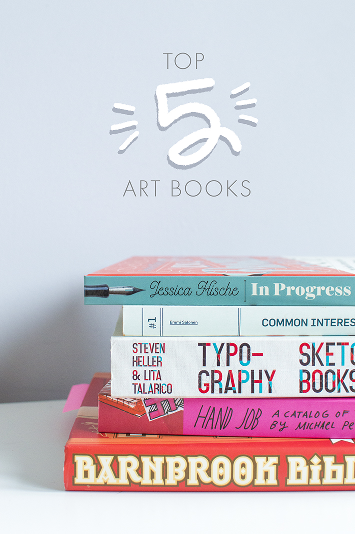
There are plenty of art books on my shelves and I wanted to share a few of my favourites. Some of them are based on individual artists, and the others are a mix of many, but they’re all full of inspiration and perfect if you’re looking for something that will spark some ideas – for both new and experience creatives.
Hand Job - Michael Perry
I was that person in the student library that hogged this books for weeks on end and kept renewing the loan – I loved this book at university so I bought it for myself as a graduate. I found it during a typography brief in my first year and this book is the whole reason why I fell in love with type – before this, I hated it because all it meant to me was fonts. Hand-drawn type wasn’t even on my radar so this was a totally new world for me and one I’m still in love with today. This book is full of loose playful and experimental alphabets as well as finished typography pieces from a wide range of different artists, full of colour and fun.
Typography Sketchbooks - Steven Heller & Lita Talarico
This was my first ‘investment’ art book straight out of university. I remember being on a trip to Poole with Graham and finding this in Waterstones, then sitting crossed legged in front of the bookshelf and devouring each and every page. At that point, being fresh graduates, £30 seemed a lot of money to spend on one book, but we couldn’t pass this up and split the cost between us. I love seeing inside people’s sketchbooks and the selling point for me with this one is that it not only shows the finished pieces, but also the blueprints of type, the thumbnails and doodles and the pages full of ideas. It has a whole range of typography in here, varying from pretty watercolour quotes to blocky, 80s inspired alphabets. A must for any type enthusiast, that’s for sure.
Common Interest: Documents - Emmi Salonen
Though these things aren’t the biggest factor in your hand lettering, they can make a difference. Everyone is different and we all have our own preferences, so I’d definitely recommend trying out a few paper stocks and different drawing tools to find your favourites. Though cheap printer paper with a low gsm is good for loose sketches, for final pieces I prefer paper of a much heavier weight. If you’re tracing rough lineart, using a lightbox will help massively in order for you to see through the paper, otherwise it’s easier to use light-weight paper. Generally, for lettering, it’s easier to use smooth paper, particularly for line art. Textured paper can be used if you’re using ink or watercolour, though my preference is always smooth as you can be more precise with your lines.
A lot of creatives use mechanical pencils for sketching as they keep a nice sharp point, though personally I am more inclined to go with a soft pencil, like a 2B, and then sharpen it out later on. If you’re inking your final piece, the pen you use will largely depend on the style you’re going for. A dip pen and ink is great for a traditional look, though it takes some practice. A brush pen helps create varying strokes with ease, or a fineliner can be used for outlines and you can fill it in as you wish.
In Progress - Jessica Hische
A recent acquisition. I’ve loved Jessica Hische’s work for a very long time so I’m surprised it’s taken me this long to invest! I also took her ‘Lettering for designers’ class on Skillshare and adored it, which prompted me to finally purchase this one. The book is excellent, very thorough in not only explaining typographic elements and layout, but also her career path and how she got to being a full time ‘letterer’. The book also talks about tools and processes, with the main part of the book showing various pieces and projects from her portfolio. You can clearly see the differences from her early work which is more illustrative to the pure type projects she creates today – her Penguin drop cap series being my favourite project of hers so far.
Barnbrook Bible - Jonathan Barnbrook
This one was a very recent purchase but not a recent find. It’s another book I remember finding in my university library and keeping for weeks – a huge inspiration for my first few design projects in the first year of my degree. Jonathan Barnbrook is a graphic designer who’s work include designing the art for Bowie’s albums, as well as creating his own typefaces.
His work is so interesting to me – in university I simply used it to reference and flick through but since I bought this new copy, I’ve been reading about his ideas and philosophy and am fascinated by his process. Often, as designers, we’ll pick a font if it looks good, but Barnbrook’s view has really changed my perceptions on type – in that the font designer had different ideas and meanings behind what they’ve created and should be used as such. An example would be his ‘Bastard’ font, which wouldn’t be used for a modern gig poster for example, because the inspiration behind the font was blackletter and monasticism. He uses typography as communication and art in itself, which is something that is so easy to forget when creating design – often we use type simply as a way to display information rather than communicate it.


