5 tips to improve your hand lettering
One. Relax
It’s always a bit nerve-wracking having a blank piece of paper in front of you, no matter how many times you’ve practiced. I like to try and be loose with my lettering, I don’t push down too hard with my pencil and I try to relax my wrist. I find that being lighter and more delicate with my strokes (before I then find a line I am happy with and going over that with more definition) helps give the words a more organic feel and the end result looks a lot more natural.
Two. Vary the height
Hand in hand with creating an organic piece of lettering comes with varying the height of the characters. Though it’s natural and important in typography to create words that have the same character height, you can be a lot more relaxed about hand lettering and the result is far more aesthetically pleasing. Dip the descenders of the characters so they come down lower than the baseline, and take the stems of the longer letters and add swashes as big as you like at the top. Similarly, if you have two letters in a word that have descenders, try not to make them exactly the same. For example, if I have a word with a g and y, I try to make the loops look different and add distinctive swirls or swashes so they’re not identical.
Three. The right tools and materials
Though these things aren’t the biggest factor in your hand lettering, they can make a difference. Everyone is different and we all have our own preferences, so I’d definitely recommend trying out a few paper stocks and different drawing tools to find your favourites. Though cheap printer paper with a low gsm is good for loose sketches, for final pieces I prefer paper of a much heavier weight. If you’re tracing rough lineart, using a lightbox will help massively in order for you to see through the paper, otherwise it’s easier to use light-weight paper. Generally, for lettering, it’s easier to use smooth paper, particularly for line art. Textured paper can be used if you’re using ink or watercolour, though my preference is always smooth as you can be more precise with your lines.
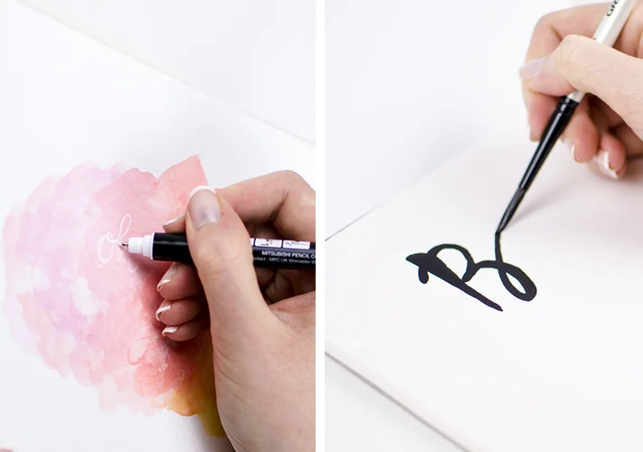
A lot of creatives use mechanical pencils for sketching as they keep a nice sharp point, though personally I am more inclined to go with a soft pencil, like a 2B, and then sharpen it out later on. If you’re inking your final piece, the pen you use will largely depend on the style you’re going for. A dip pen and ink is great for a traditional look, though it takes some practice. A brush pen helps create varying strokes with ease, or a fineliner can be used for outlines and you can fill it in as you wish.
Four. Inspiration
While we all know it’s important not to plagiarise – it can be good to copy. If you are browsing Pinterest and see a particular quote or font that you love, copy it down. Take your sketchbook and draw the curves of the letters. What is it you like about the font? Is it the particular way it flows, the ligatures are large or they’ve done a specific letter differently to how you normally would? Practice creating different letters on your own using it as inspiration. It’s easy when creating your own lettering to stick to one style, and this is a great way to improve your art and discover new methods that you may not have thought of otherwise. (Though it’s important to note, copying something directly with intentions of selling or displaying it as your own, is not ok. We’re just using it as practice here).
Five. Digital enhancement
There isn’t anything wrong with a bit of digital touch-up. The knowledge of being able to fix mistakes later on gives me a lot of additional freedom when creating artwork (unless of course, you’re planning on selling the original). Generally though, it means that we can be more relaxed and if we do make mistakes, we don’t need to start again. I scan all my artwork in to the computer so I have a digital copy, and then use Photoshop for any adjustment. The eraser tool is perfect for touching up any wobbly lines or accidental scribbles, and I also like to adjust the curves to increase the contrast between the lineart and the paper. These little digital enhancements will help your final artwork look professional and finished. Of course, if you’re unhappy with the drawing in the first place, taking it on to the computer won’t fix any big mistakes, so make sure you’re happy with the framework of the design before scanning it in.


